Cool Springs Family Dentistry was expanding into a new office—and saw it as the perfect time to elevate their brand. Dr. Woods wanted the new look to feel more like her: modern, calming, and rooted in the Franklin, TN area. She loved horses and had deep hometown pride, but wanted to avoid veering too far into “equestrian” and risk looking like a veterinary practice.
She needed a brand that could bring those elements together while still clearly saying “we’re a dental office.”
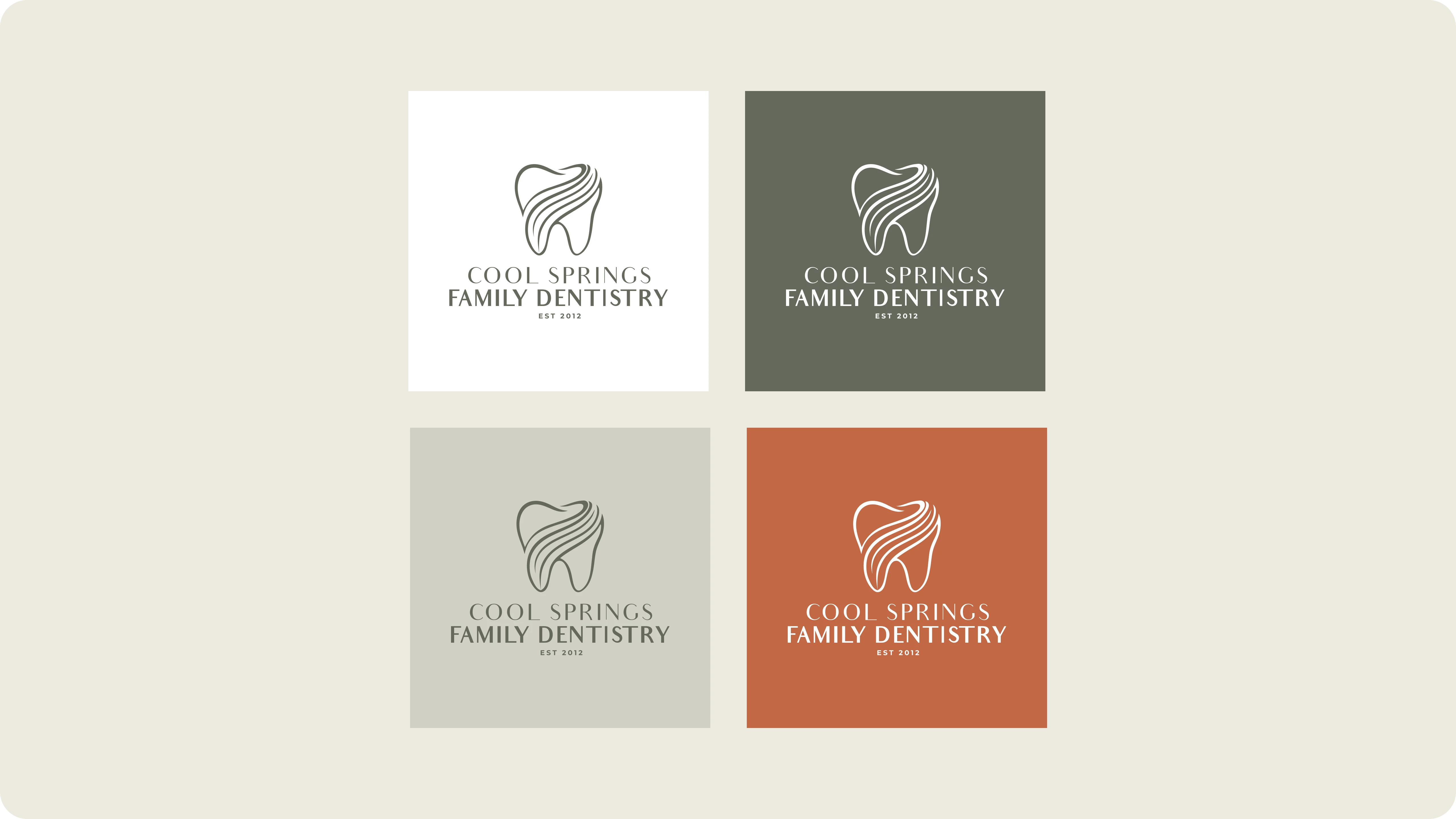
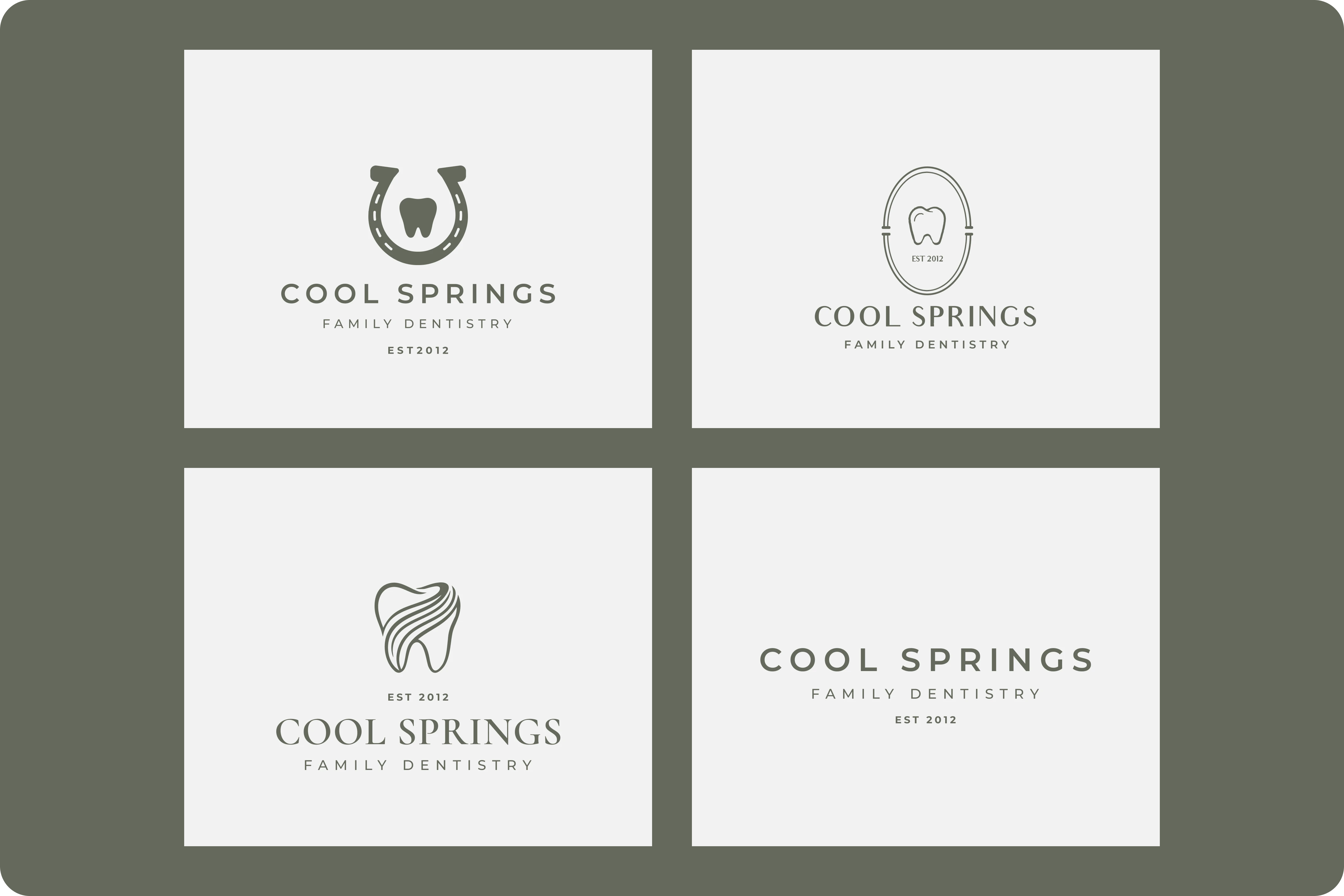
We started by understanding her new office layout and interior aesthetic—using that as inspiration to shape the brand visuals. The final identity blended homestyle charm with modern professionalism, and featured a clever, custom icon: a tooth with a flowing, graphic element that doubles as a horse’s mane.
The symbol is subtle and unique—bringing in the equestrian feel without overwhelming the brand. It’s the kind of detail that tells a story when you know where to look, and Dr. Katie immediately connected with it.
We delivered a logo suite and brand guidelines to keep everything consistent—from exterior signage to future marketing.
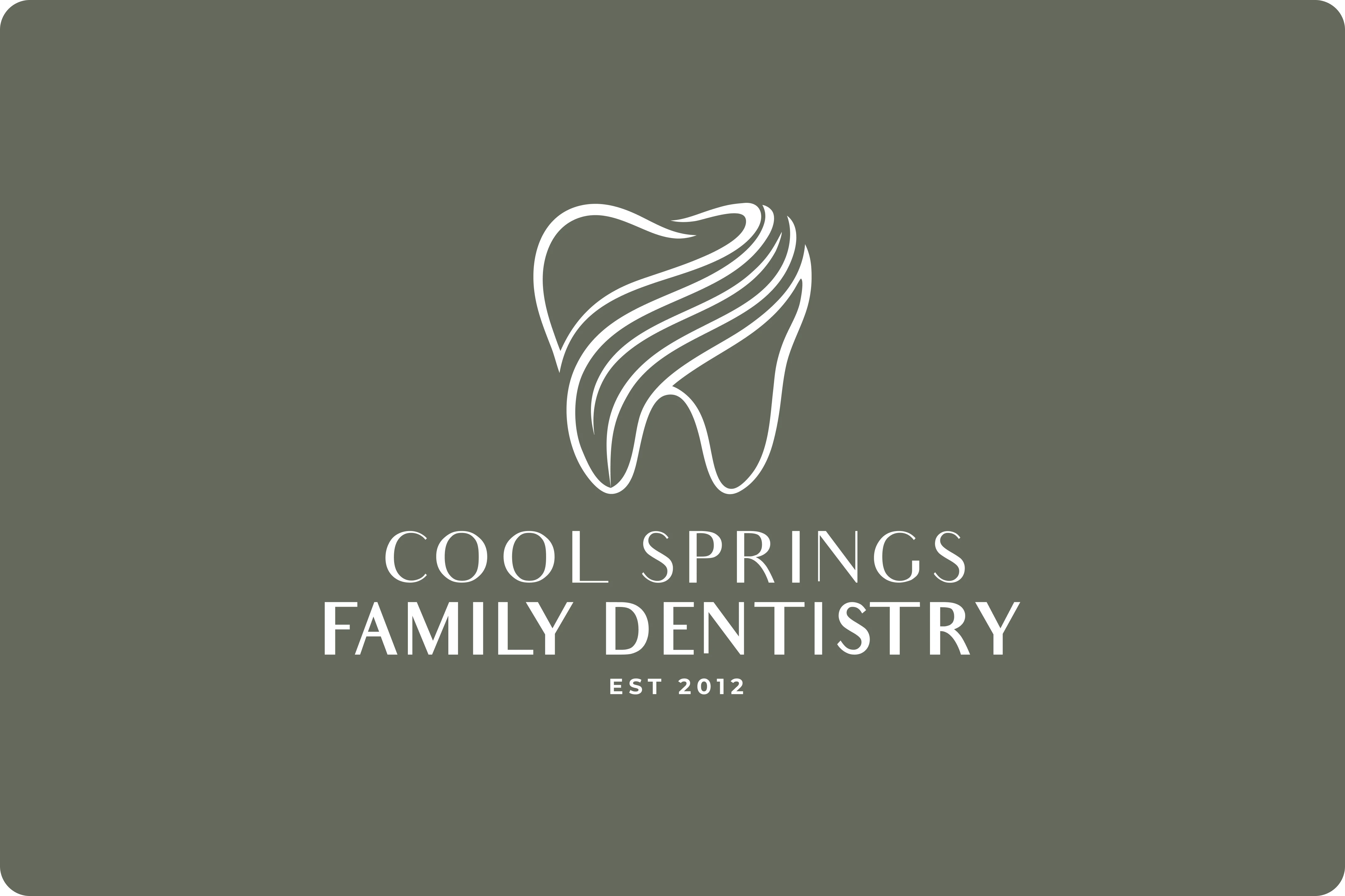
Dr. Katie was able to submit her new brand in time for exterior signage production—keeping all of her updates cohesive and on schedule with the office move. The brand now serves as the foundation for future marketing, interior styling, and community connection.
Related Services

Logo Design
Your logo is the face of your business, and we make sure it’s memorable. We design logos that reflect your brand’s personality and create instant recognition.


